
How to Choose the Perfect Hues for Your Home Décor
Your dwelling surpasses mere habitation; it mirrors your individuality, serving as a haven for cherished memories and an open canvas to display your distinctive flair. Among the most influential techniques for imprinting your personal signature onto your abode is the judicious curation of colors. Whether it’s the walls enveloping your chambers or the furnishings embellishing them, the shades you opt for assume a pivotal role in crafting an atmosphere that resonates with both your sensibilities and the comfort of your guests. Within this guide, we shall delve into the intricate art of selecting the perfect hues for your home decor. It’s an expedition that imparts insights and counsel, guiding you towards the creation of a dwelling that exudes harmonious charm, welcomes with irresistible allure, and authentically embodies your aesthetic inclinations.
Elevate Your Space with Thoughtful Ceiling Colors:
When discussing home decor, the walls often take center stage, but the ceiling should not be overlooked. The color of your ceiling grid tiles can have a surprising impact on the overall perception of a room’s dimensions and atmosphere. While white is a classic choice for ceilings as it imparts an illusion of height and space, don’t be afraid to explore other options. A soft, complementary hue to your wall color can create a cozy and enveloping feeling. On the other hand, a darker ceiling color can add drama and intimacy to larger rooms. Remember that ceiling colors interact with the room’s lighting, so be sure to consider both natural and artificial lighting when making your choice. Thoughtful ceiling colors contribute to the holistic harmony of your decor scheme, enhancing the overall visual experience of your living space.
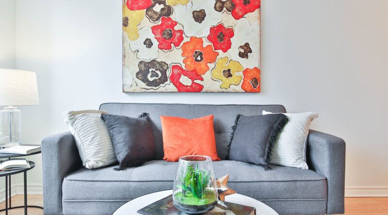
Achieving Visual Harmony with Existing Elements:
When choosing colors for your home decor, it’s important to consider the existing elements within the space. Take note of the colors present in your furniture, flooring, and fixtures. Rather than clashing with these elements, aim for a harmonious blend that brings everything together seamlessly. If you have a standout piece of artwork or a cherished furnishing, draw inspiration from its palette to guide your choices. This approach ensures that your color scheme maintains coherence and avoids an overly disjointed look.
Leverage the Color Wheel as Your Guide:
The color wheel, a fundamental tool in color theory, can serve as your trusted guide when selecting hues for your home decor. Complementary colors, which sit opposite each other on the wheel (think blue and orange), create dynamic visual contrasts. Incorporating these pairings can add vibrancy and energy to your space. On the other hand, analogous colors—those adjacent to each other on the wheel (like blue and green)—blend harmoniously and create a sense of unity. When crafting your color palette, consider designating a dominant color, one or two secondary colors, and an accent color to maintain a visually balanced and engaging look.
Aligning Colors with Mood and Function:
Different rooms serve different purposes, and the color choices should align with the intended mood and function of each space. A bedroom, for instance, should evoke a sense of serenity and relaxation, making soft pastels or calming neutrals excellent choices. In areas where social interaction is encouraged, such as kitchens or dining rooms, warm and inviting tones can stimulate appetite and conversation. By tailoring your color selections to the specific purposes of each room, you can create an atmosphere that enhances the overall experience.
Testing Before Committing:
Before diving headfirst into a complete room makeover, it’s crucial to test your chosen colors in the actual environment. Purchase small paint samples or fabric swatches of the colors you’re considering and place them strategically around the room. Observe how they interact with different lighting conditions and existing elements. This testing phase helps you gauge the visual impact of the colors and ensures that the final result aligns with your vision.
Choosing the ideal colors for your home decor is a dynamic and imaginative journey that demands meticulous contemplation. By exploring the intricacies of color psychology of your square edge ceiling tile, factoring in the nuances of natural light, creating synergy with the existing components, employing the color wheel as a compass, reflecting on the ambiance and utility of each area, and subjecting your selections to testing, you have the ability to fashion a living space that resonates with visual allure while profoundly mirroring your individuality and inclinations. Your dwelling ought to epitomize solace and self-expression, and through astute color decisions, it can evolve into a living masterpiece that warmly embraces you every single day.